
Train Station Monitor
A diagnostic UI that records how loaded each train station is
over time and draws a compact, color-coded timeline per station.
Makes it easy to see at a glance which resources are keeping up and which are falling behind.
What it shows
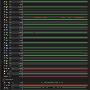
Stations are grouped by name (all stops sharing a name across all your surfaces are one row).
Each row is a left-to-right timeline (oldest on the left, now on the right) drawn as a thin
two-line step trace centered vertically in the row, so each moment is encoded by both color and
vertical position:
| Appearance | Meaning |
|---|---|
| Green line, just above center | Full — trains at the station's limit (count ≥ limit) |
| Red line, just below center | Below limit — spare capacity |
| Grey lines, straddling center | No train limit set, or circuit-disabled |
| Empty gap | The station didn't exist during that time |
For a name with several stops, the row reads as full (green) only when all limited stops are
saturated, below (red) when any stop still has spare limited capacity, and grey when none of
the stops have a limit.