Agricultural tower placement helper

by Quezler

Shows you the difference between tiles that require artificial soil vs (yet to unlock) overgrowth soil.

Utilities
10 months ago
2.0
2.01K
Factorio: Space Age Icon Space Age Mod
Environment Manufacturing

g Colour blind settings

10 months ago

Hi

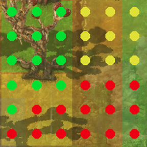
Thanks a lot for making this mod, it was incredibly difficult to see the difference in yellow / green from the default Factorio graphics

I also had difficulty with the colours of this mod but one quick settings change allowed me to set the green dots to blue to make it very clear

https://i.imgur.com/Ia9A2Pr.jpeg

I recommend adjusting it as the default to help others if you are open to the idea

blue = {0.0, 0.0, 0.9, 1}

Thx!

10 months ago
(updated 10 months ago)

Where did you change the color? Because I am colorblind and this is just so close to being a sanity-saving mod.
Edit: figured out to edit the LUA file in the mod archive in the mod folder. Changed "yellow" to {0.9, 0.5, 0, 1} and it is a sweet balm to my soul.

10 months ago

colorblind support added in 1.0.3 (and 1.0.9 of notice me senpai)

10 months ago

Thank you!

8 days ago

Would you consider renaming the settings?

Green -> Placement possible (green)
Red -> Placement forbidden (red)
Yellow -> Soil required (yellow)

As it stands, I had to set "green=blue"
And settings like this can be kind of confusing without the correct context.

I also would not mind different default values for the different states, but I'm fine with picking my own.

2 days ago

Also … can we maybe introduce different shapes for the different colors?
I am thinking of filled green circles for "yes", empty yellow circles for "need soil" and finally red crosses for "no"
Could even use the unicode symbols ⬤◯✖️

2 days ago

that feels like a visual nightmare tbh, shapes act really weird at certain zoom levels.

2 days ago
(updated 2 days ago)

More visual nightmare than trying to build on Gleba while colorblind? Encoding information in hue only is just terrible for colorblind people. Coupling hue with shape is much better, design wise, as it could even work in grayscale.
And I'm not saying those are the only reasonable shapes. A square could work at any zoom level.

New response