GUI Unifier

by snouz

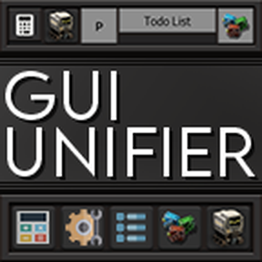
Forces mod buttons to look uniform and aligned, harminizes icons, and adds visual options for buttons for 117 mods and counting from mods such as Factory Planner, Helmod, YARM, Module Inserter, Bob's mods, Pyanodon, Schall's mods, Todolist, Creative Mod and many, many more! Now updated & Maintained for Factorio 2.0 & Space Age by SolusCaelum

Tweaks
2 months ago
1.1 - 2.0
56.3K

g Icon set

3 years ago

What icon set do you use? Do you just google for something that you think fits better or do you have a specific palette of icons you choose from?

I am the author of the Screenshot Toolkit and my idea of making a camera-cyclops failed tremendously. I plan to change the icon to some sort of camera and maybe add some more icons in the ui. Seeing that your mod apparently hits a nerve it would be nice to have an icon that does not make people cringe :D

3 years ago

Hi ! Your toolkit icon is cool, I just changed the aesthetic of all flat white icons, as I wanted everything to have more volume and color, I just think it's easier to understand.
I'm not using one particular set, I'm usually either googling images or using this site: https://www.flaticon.com/search?word=build&type=icon&license=selection&order_by=4&filter_style=flat
It's full of already transparent, flat, free icons, and I usually add volume with photoshop effects. I also use the game's icons. I tried to go with the most identifiable images based on function, and since I "unify" the style, some icons are losing a bit of personality in the process.

3 years ago

Oh, thats a very nice site. I was mostly using Font Awesome for icons, and those are a bit of work to look nice. I will definitly use that site from now on, thanks a lot!

Your toolkit icon is cool

Personally, I think so as well, but there are a lot of people who don't recognize the cyclops or are simply wondering what it should display

New response