Just One Last Task - (JOLT)

by Arcosh

A task/todo mod (now in beta for multiplayer) where you can organize tasks by group, perfect for Space Age with a group for each planet. Easy to add to existing saves.

Utilities
a month ago
2.0
599

i Too easy to delete a task

a month ago

I like the interface overall, it is not too complex and look pretty.

If you click on a task, it is like it is checked immediatly and the task is deleted. I was expecting the task to open up to read its detail, because I did not click on the checkbox, I clicked on the task name.

Because there is no way to recover, deleting should not be that easy. You could also add a confirmation window. Or maybe checked task should not be deleted and still be on the list, with a filter that allow to hide them.

a month ago

Thanks for the feedback! I'm glad you like the design.

I have good news clicking the task actually doesn't delete it. It marks it "completed" and you can view/hide completed tasks by toggling the "Show Completed" checkbox in the controls row (see link which has a screenshot).
You can select a completed task again to mark it as incomplete.
You probably found it but at the far right of every task is a toggle details button ">" where you can expand to view subtasks and the description.

https://github.com/user-attachments/assets/a1cc9c36-8c8a-43f6-9101-825a0148e022

So your feedback is very helpful. I am planning a user-interface update and was thinking about changing it so clicking on the task expands the details like you suggested. (I would also separate so the checkbox so you can mark it complete/incomplete only when you click on it and not the text).

Do you have any suggestions on how to make it more clear that a task was not "deleted" but actually "completed"? I feel I could do a better job to showing that. (I think you can do tutorials for mods so that's something I might look into).

a month ago

If the only way to "complete" the task is to check the checkbox, and not click the full text, that will address most of the issue.

To make it clear that the task is not delete when you check it, I don't think anything must be done in the "check flow". If the user know where to find the completed tasks, that will be enough. I don't why I missed it.

a month ago

+1

Just clicking the box and using the rest of the text field as drag bar or as "click to expand" would be much more usable

a month ago

Unfortunately dragging isn't available for mods but clicking to expand the task makes a lot of sense to me.

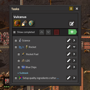
I'm not sure how much work it will be but eventually I do want to add a status to each task (I found playing it in multiplayer this matters a lot more), and if there's a status then it makes it more confusing to have a checkbox as well. What do you think of this layout and icons?

image

At the left the checkbox would be replaced with a dropdown button for task status, and then clicking the task title would expand/collapse the task details and subtasks.

I do really like the separating checkbox and task title idea, so if this seems like it might be a bit difficult to implement now I might just do that and add the status later. Just wanted to hear what you both thought about the task status idea.

a month ago

So it wasn't too difficult to implement so I pushed a new release v0.6.0 with the task status dropdown, and changed it so clicking the task toggles the details for that task.

New response